POST OB
I came back from Outward Bound last week and had the most fantastic week in my life. It took me a while to get back to the real world. Here is the photo of our sailing course. 
At last, it goes to the box.
I had spent quite some time choosing between redesigning the yoghurt cups,coat hanger and cereal boxes. I’ve done mindmaps trying to analyse which one has more chances to add value. I also tried out my “pollination colour wheel”, which is my own creativity generation device as shown below.

Eventually I went for the box. The reason is I think there are more opportunities to recycle the cardboard box. It should be fun to do some origami although I recall that I once spent 3 bloody hours just to fold 3 stars for my best firend’s birthday. I was aiming to make a full jar of them, but after hours of struggling I finally gave up on this silly idea. It might take me months to fill the jar due to my speed. Well, some people are just not that good with handcraft. What can I say? It should be fun. I hope I won’t cut myself or anything like that.
Thoughts from research II
1 Tissue box: I’ve thought about making the tissue box adjustable to the volumes of tissues left in the box, by tearing off the top half of the height of tissue box and make the lid come off and reattach to the bottom half.
2. Tea box: The closing tab is creative yet thoughtful. It prevents accidents like dropping all your tea bags out of your pantry.
3. There is a plastic sheet in between sticky tags. It allows users just to get one tag withought peeling off too many at a time.
4. Icebreaker Package: The design, as well as the material, of the draw increases the product value.
5. Cup Handle: Here is an interesting one. For people who are fond of peral milk tea ( Taiwanese cold drinks), it’s a real hassle to carry the cup without asking for a plastic bag for it. Now they have come out of a brilliant solution for diminishing the use of plastic bags. Simply put the central loop around the cup and use the other two loops on the side as handle. Viola! It’s smart, economical and eco-friendly. Best of all, it’s reusable and you can carry it everywhere by wearing it as bracelets.
6. Chocolate box: I’ve noticed that most of the food packages are composed of a plastic bag plus a paper box. What a waste of materials. Big no no for the sustainability design. What can you do with the paper box since it’s almost impossible to reuse the plastic wraps/ bags.
7. Royal Albert Soap Package: The package itself definitely adds value to the product. It feels like opening a gift box when you unwrap the ribbon. There is also a folder slab to seperate two bars of soaps. The expensive looking package of soaps distinguishes a great gift from cheap daily necessity .
8. Cereal Box: Well, every time I open and flatten the cereal box and put it in the paper recycle bin, I feel like there must be some other way to recycle the big piece of cardboard. It’s just a waste to throw it away like this. I may further develop the ideas of reusing cereal box apart from making it a breakfast tray.
Japan Packaging Contest 2006
Japan has long been notorious for their excessive packaging, such as individual packs for each piece of cracker. So I was pretty impressed to see the efforts they put into recycling when I traveled to Japan in 2006. They sell drinking water bottles with easy-peeling labels and easy-sqeezing materials for comsumers to diminish the hassle when recyling . Apparently they are more aware of the eco-friendly issues now. Here are two award winning packages which delivered the message of sustainable design.

New Proposal Pouch : DIPO®, no need to repack, friendly to environment
TOYO SEIKAN KAISHA, LTD.
With the advent of the easy-to-use pouch, there is no need to refill bottles any more. It saves packaging material, reducing environmental burden. Liquid soap, shampoo or kitchen detergent can go in this container.

Fold-up Package for LCD-TV “AQUOS”
SHARP CORPORATION
OJI CHIYODA CONTAINER CO., LTD.
After the purchase of the LCD-TV, the package can be cut into two pieces and folded without using a cutter. This volume reduction facilitates the recycling process. The concept of universal design was applied.
motif
I’ve pinned up some packages that either contain or lack a good design motif.
Will post a photo later to explain my thoughts about them.
I glanced briefly at the recycle bins sitting on the grass outside my driveway last weekend, and tried to rule out what are the most common packages that are consumed by households. They might have the potential to be recycled by users instead of the EnviroWaste.
I noticed that people ( ok, just my neighbors) tend to drink a lot of milk and wines.
What can I do with lots of milk bottles apart from them being the containers to hold milk?
Hmmm….
I have sweet tooth and always store a lot of snacks in my pantry.
Chocolates, candies, biscuits, lollies, puffs….all sorts of Japanese and Taiwanese sweets.
Most of the snacks are packaged in a plastic bag then put in a cardboard box.
Even cereals!
Chatted with classmates yesterday and mentioned about my idea of making
cereal box a breakfast tray to hold a bowl, a glass and spoons for kids.
It could be a direction to work on. Will see…
Thoughts from research
I quite like the concept of giving the object “a second life”.
I still remember how amazed I was when I first saw the Hell pizza box transforming into a little cuffin for a slice of pizza. It was a brilliant idea! This picture shows another surprising way to recycle your old clothes.
I have basically decided to go for the direction of recycling the original packages and give it a brand new use.
Transformer??
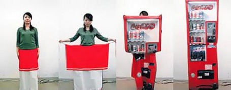
We were under the impression that Japan was so awesome crime didn’t exist there. Unfortunately, it does. To ward off criminals, fashion designer Aya Tsukioka has conjured up some neat transforming clothes/accessories to deceive potential muggers. Whether there would be time to get your kit out in an attack is probably something we would not want to test out, but the concept makes for one kick-ass gallery; check it out below:
test out, but the concept makes for one kick-ass gallery; check it out below:
Original website:
http://gizmodo.com/gadgets/clothing/transforming-safety-clothing-inspires-sexual-fantasies-313221.php
Examples include a skirt that transforms the wearer into a nondescript vending machine (yes, seriously) and the unfortunately titled Manhole Bag, which converts a lady’s handbag into what appears to be a sewer cover with the contents kept safe inside. We think it is a bit ridiculous, but we just can’t help thinking that Frucci is cruising the streets as a big red vending machine. Classic Frucci.
Doing more with less
Again, another awesome article about package design.
http://www.packagedesignmag.com/issues/2007.09/designers.corner.shtml
Sustainability of package design
Found a good article on Package Design Magazine website. It provides serveral directions fot green package design. ENJOY! http://www.packagedesignmag.com/issues/2006.11/special.green.green.means.go.shtml
I.D. Annual Design Review 2006- Packaging
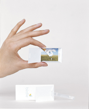
Birdie Hangtag
The San Francisco design firm Pool was involved in developing Birdie’s visual identity from the beginning. It hatched both a sprightly logo (a bird perched on a golf tee) and a winning tag line (“Play more”) for the fledgling line of hip women’s golf wear launched this spring. When it came to creating a hangtag, principal Jon Ritt, who doubles as Birdie’s creative director, and Pool designer Marius Gedgaudas felt the usual flimsy paper card with a skinny plastic cord wouldn’t do. They wanted their design to help define the Birdie brand, which breaks from the staid argyle-dependent look of traditional golf attire. “The purpose of the hangtag is simply to identify size and price, and to provide a place for the bar code,” notes Ritt. “But there’s no reason it shouldn’t work a little harder than that.”The designers went with a satisfyingly thick strip of stiff white fiberboard laminated on both sides with polished paper and punched with a die-cut rectangular hole. The logo appears on the front with the price; the company website is printed on the back, where the bar code appears. A clear vinyl band stamped with the company name is threaded through both the main hangtag and a tiny embossed envelope that unfolds like an artist’s portfolio. Inside lies a card with a photo of a golf scene backed by one of a series of secret messages that range from golf etiquette tips to the recipe for a Dirty Birdie cocktail. Just as the company’s clothes have surprising little extras, like buttons sewn into seams for decoration, the hangtag has its own “little Cracker Jack prize,” says Ritt.
Such finicky detailing (the fold of the envelope, the width and thickness of the vinyl strip, and the size of the die-cut hole were all carefully calibrated to hold together without glue) jacked up the hangtag’s price tenfold, to nearly $1. Likewise the decision to produce everything locally, where the designers would have more quality control, rather than over-seas. But if the hangtag can help Birdie differentiate itself, Ritt and his team believe the design will have proven its worth.
The jurors were inclined to agree. “They’ve gone way beyond the typical hangtag,” said Zinzell. “They’ve reinvented it as an entertainment center.”
—
DESIGN Pool (San Francisco): Jon Ritt, creative director/designer; Marius Gedgaudas, designer
CLIENT Birdie (San Francisco)
MATERIALS Laminated blotting paper, heavy card stock, classic crest cover stock, metallic silver PMS, clear vinyl
SOFTWARE Adobe Illustrator and Photoshop


Recent Comments